Land Doesn’t Vote, People Do!!!!
Share
A Case-study of Early Primary Vote in Collin County
In a political season few longtime observers of Collin County would have predicted, Republicans and Democrats are running neck and neck in this year’s primary — a striking development in what has long been considered a Republican stronghold.
For decades, Collin County has delivered comfortable primary margins for GOP candidates. But this cycle feels different. A mix of national tensions, state-level debates, and hyperlocal concerns — from school governance and property taxes to infrastructure and public safety to misinformation against legal immigration and widespread Islamophobia — has energized voters across the political spectrum. Early turnout data suggests that Democratic participation has surged while Republican turnout remains strong, creating a competitive environment that would have seemed unlikely just a few years ago.
Yet, anyone glancing at a traditional county map might come away with a very different impression.
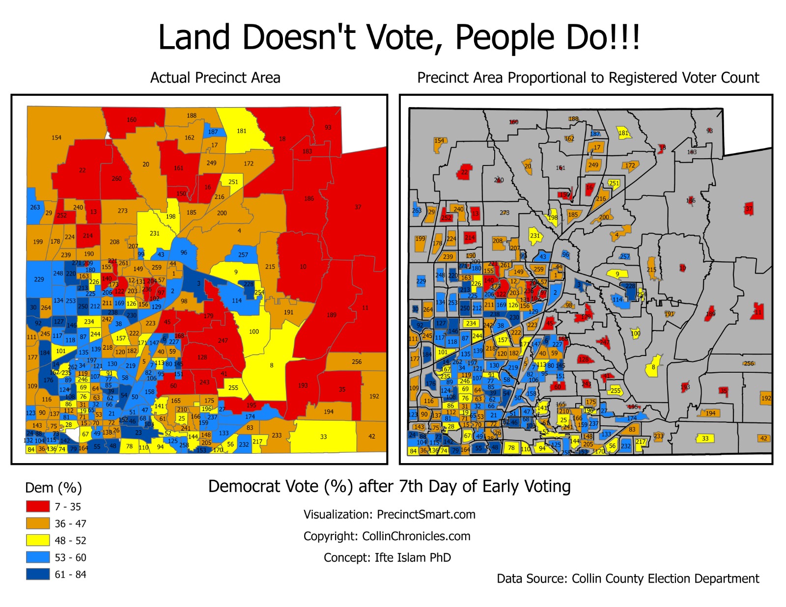
Standard election maps typically shade each precinct according to which party is leading. In Collin County’s case, much of the map appears awash in orange, red, and deep red — signaling Republican leads in roughly 70 percent of precincts. At first glance, the visual reinforces the long-held belief that the county remains firmly in GOP control.
But there’s a catch.
Many of those red precincts are geographically large but sparsely populated. They stretch across peripheral areas of the county, covering substantial land mass while containing relatively few voters. Meanwhile, more densely populated suburban precincts — often more politically competitive or trending Democratic — occupy much smaller physical areas on the map.
The result is a visual distortion. Large, low-population precincts dominate the canvas, while high-population precincts shrink into small shapes that are easy to overlook. For regular voters, donors, and even casual political observers, this can create a misleading perception that flipping the county is unrealistic or that one party’s dominance is overwhelming.
To address this imbalance, a new, more sophisticated visualization has emerged — one that could soon appear in local news coverage. Instead of sizing precincts by geographic area, the updated map scales them proportionally to the number of voters in each precinct. In other words, land mass takes a back seat to population weight.
The effect is dramatic.
Under the proportional model, many of the sprawling red precincts shrink significantly, reflecting their comparatively small voter bases. At the same time, densely populated precincts expand, offering a clearer representation of where the majority of ballots are actually being cast. The political landscape begins to look less monolithic and more competitive.
This type of cartogram — sometimes called a population-weighted map — does not change the vote totals. Republicans may still lead in a majority of precincts by count. But it reframes the conversation by emphasizing voter concentration rather than acreage.
For a county like Collin, where rapid suburban growth has transformed communities in cities such as Plano, Frisco, McKinney, and Allen, that distinction matters. Political power follows people, not square miles.
As the primary unfolds, the numbers — not the land — will ultimately determine the outcome. But how those numbers are visualized can shape public perception in powerful ways. In a race that is suddenly competitive, presenting a clearer picture of voter distribution may prove just as important as the vote count itself.
This year, in Collin County, the map tells a more nuanced story than ever before.